Thursday, April 24, 2014

Group Project II

We continued to take portraits in the style of each classmate and tried to emulate their camera and editing techniques. This assignment is to celebrate each classmate's work.

Kaeli- I tried to emulate Kaeli's style of street photography and filling the frame with a scene. I raised the temperature of the picture to create her pastel-color scheme and also added the Cross Process effect on PicMonkey. 


Aidan- For Aidan's portrait, I attempted to recreate his architectural photography style by taking his picture in black and white with a building and a reflection of trees at an interesting angle. His pictures also have a high contrast so I increased the contrast for his portrait.


Max- Max's street photography style was taking pictures in black and white and only raising the contrast and brightness by a tiny bit. 


Sam- Sam overlaid pictures of the same person and took them in sometimes black and white and sometimes color. I also raised the brightness of the background by a small amount. 


Giv- Also focusing on street photography, Giv took candid shots of street life in black and white. I also raised the contrast and added shadows to give the pictures a graver tone.


Laurence- Laurence took pictures of subjects with a large scale background and in black and white. I noticed that most of the time, his pictures have a really bright area.


Charlie- Charlie presented surrealism in his pictures and he sometimes layered backgrounds, faces of animals, or both using Photoshop. I tried using PicMonkey to produce similar effects and used the overlaying and the cloning features.


Nico- Nico took non-traditional candid portraits in black and white with high contrast. I boosted the contrast and shadows for his portrait and tried to shoot with a large scale background.


Friday, April 4, 2014

Group Project

In this final project, we are taking portraits in the style of each classmate and trying to emulate their camera and editing techniques.

Ramona- For Ramona's portrait, I tried to capture the warm, bright, and inviting feeling that her pictures have. She chooses to shoot objects that have a pastel color scheme, so I edited the picture to make the pink/magenta more prominent. I also raised the temperature of the picture.


Simon- For Simon's portrait, I applied his double exposure technique and layered scenery over his portrait.


Lindsey- I colored the background black to try to get the still life effect that Lindsey worked with and positioned her in the center, just like her still life photos.


Iriana- Iriana took pictures in Richard Avedon's style and captured the subject's real emotions behind his or her mask. I edited the picture to have a high contrast and produce a white background. That way, all the focus will be on the subject's face and emotions.


Joel- Joel worked with different textures and edited them to become more abstract and layered. I layered his portrait with the paint, water, and space textures on Picmonkey. His pictures are also really focused, so I cropped the picture to only focus on the texture of his face.


Ale- Ale's pictures have a lower contrast compared to the pictures of the other students. I lowered the contrast and increased the shadows. His pictures also have a fuzziness aspect, especially in his still life series, so I used the soften feature on Picmonkey.


Friday, March 21, 2014

Series Draft IV

For this fourth batch, I have shot a variety of subjects. I continued creating nostalgic and inviting environments in my pictures. In addition, I tried to avoid shooting in the bright light and avoid the bright areas from taking attention away from my subjects. If there were bright areas in my pictures, mainly the sky, I used Picmonkey to edit them.


Thursday, March 13, 2014

Series Draft III

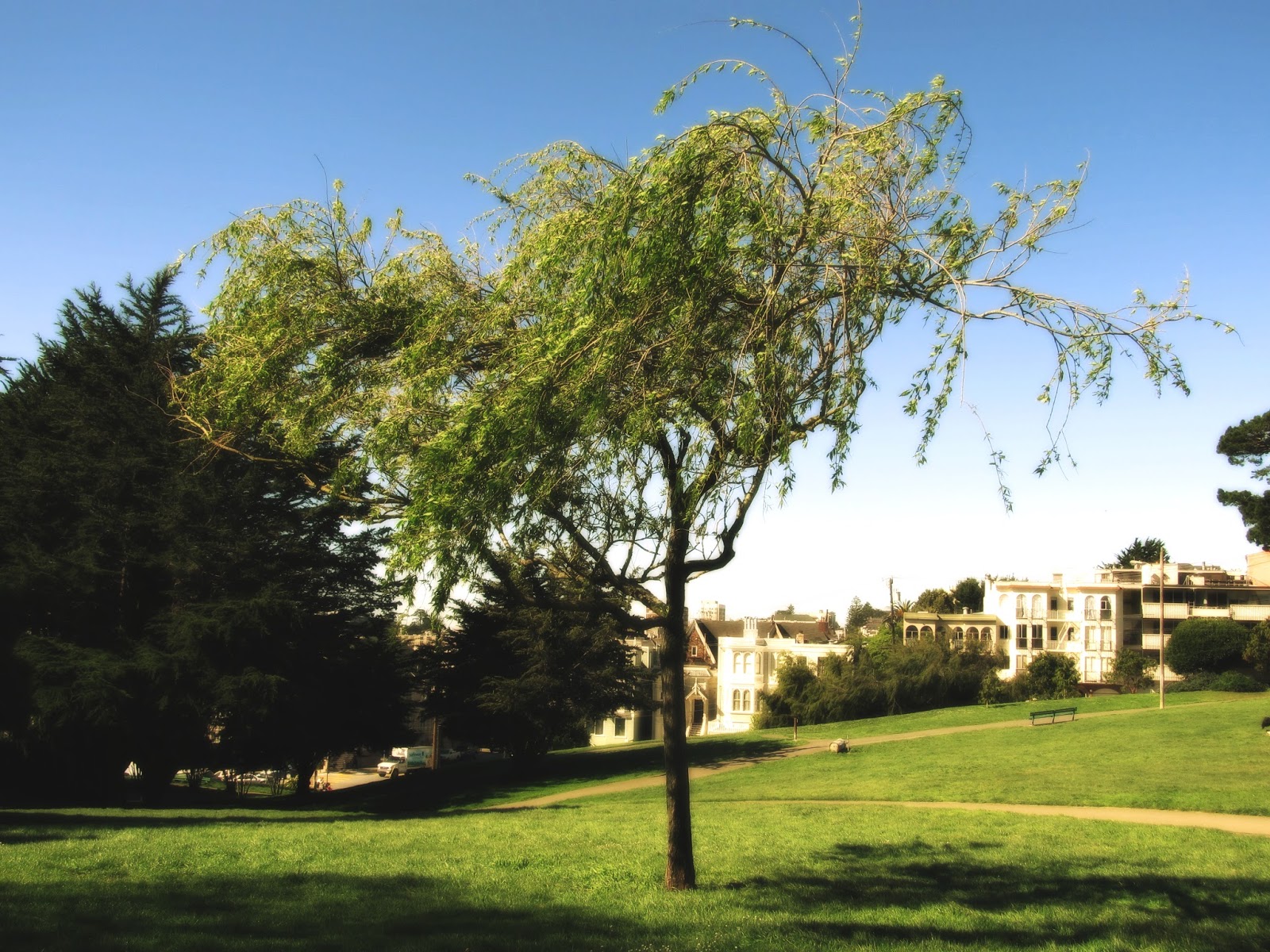
In the third draft of my series, I have gotten the hang of editing my pictures to create a dreamy, warm, and nostalgic feeling. I visited Alta Plaza Park and Cobbs Elementary to shoot. The main focus for this batch was San Francisco's nature and displaying as much green as possible.


Friday, March 7, 2014

Series Draft II

In this new batch, I concentrated on photographing driveways, streets, and houses. I tried to find subjects with a colorful aspect that becomes the focus of my images. Creating depth and capturing "remnants of humanity" continue to be my main goals. Also, I have found a new effect on PicMonkey that adds the nostalgic feeling to my images called Sunglow, in addition to the Soften effect that I have been using. 


Thursday, February 27, 2014

Series Draft I

In this new series, I am continuing to emulate Eugene Atget's style. However, this time, I am shooting antiquated buildings, streets, and signs, and nature in color. I will be challenging myself to recreate the same nostalgic, dreamy, and "remnants of humanity" feeling. With our high-tech cameras, it is difficult to shoot blurry and dreamy pictures, so I have used the Soften effect on Picmonkey. My images feature leading lines, repetition, and depth staging to create depth. In addition, the whole scene is shown and not cropped to give the full story in my pictures.


Thursday, February 6, 2014

Filters

In this assignment, we tested out the different filters and effects on Picmonkey and Photoshop. The goal is to allow us to explore the different ways we can alter our pictures and hopefully choose an effect or combination of filters that we like and use in a series.


Filter used: Chrome in Photoshop


Filters used: Glowing edges, Diffuse glow, and Cutout in Photoshop


Filters used: Cutout and Glowing edges in Photoshop


Filters used: Glowing edges and Ink outlines in Photoshop


Filters used: Neon glow in Photoshop


 Filters used: Ombre in Picmonkey, Changed brightness in Picmonkey, Cutout in Photoshop